Workshop archive
A workshop, not a museum: experiments, rejected concepts, product screens and one personal crest. Fifteen with honest captions beat forty without a story.
Not everything I make becomes a case study. This is what remains — signals, not just outcomes.

Personal crest
The shield's sharp base continues the "M"'s own V-shaped notch — together they read as a "V" (Maxim Vechkitov). One file, two roles: the tab favicon and the stamp in the site header.
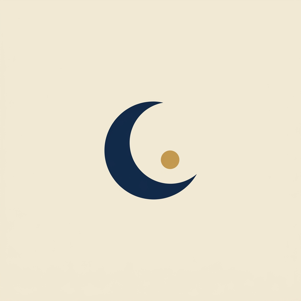
Skazia · “Crescent”
Design critique called this the cleanest, most timeless of the three — but “Path-S” won. Sometimes the correct mark loses to the more telling one.
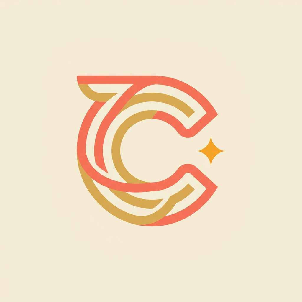
Skazia · “Path-S”
The Cyrillic “С” as a continuous path-ribbon ending in a small light — the fairy-tale route. The working pick; lives in production as the channel and bot logo.
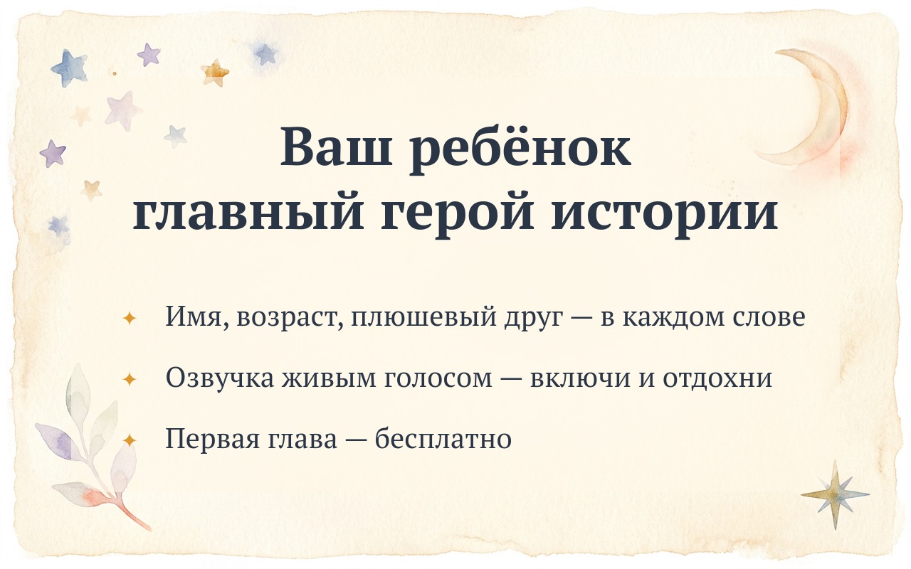
Skazia · welcome banner
The bot’s first screen — the promise in three bullets. The watercolor palette became Skazia’s visual language, spreading from here to the hero atlas and OG images.
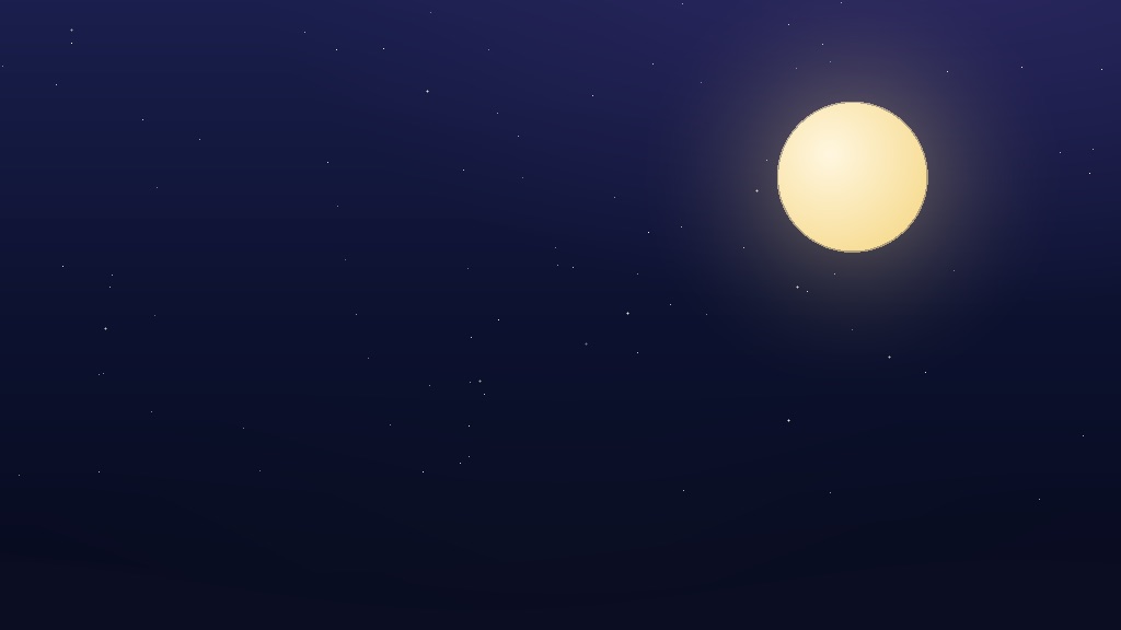
Skazia · episode 1 night background
The night sky for chapter one — countable stars and a warm moon, not a cold one: the child falls asleep instead of fearing the dark.
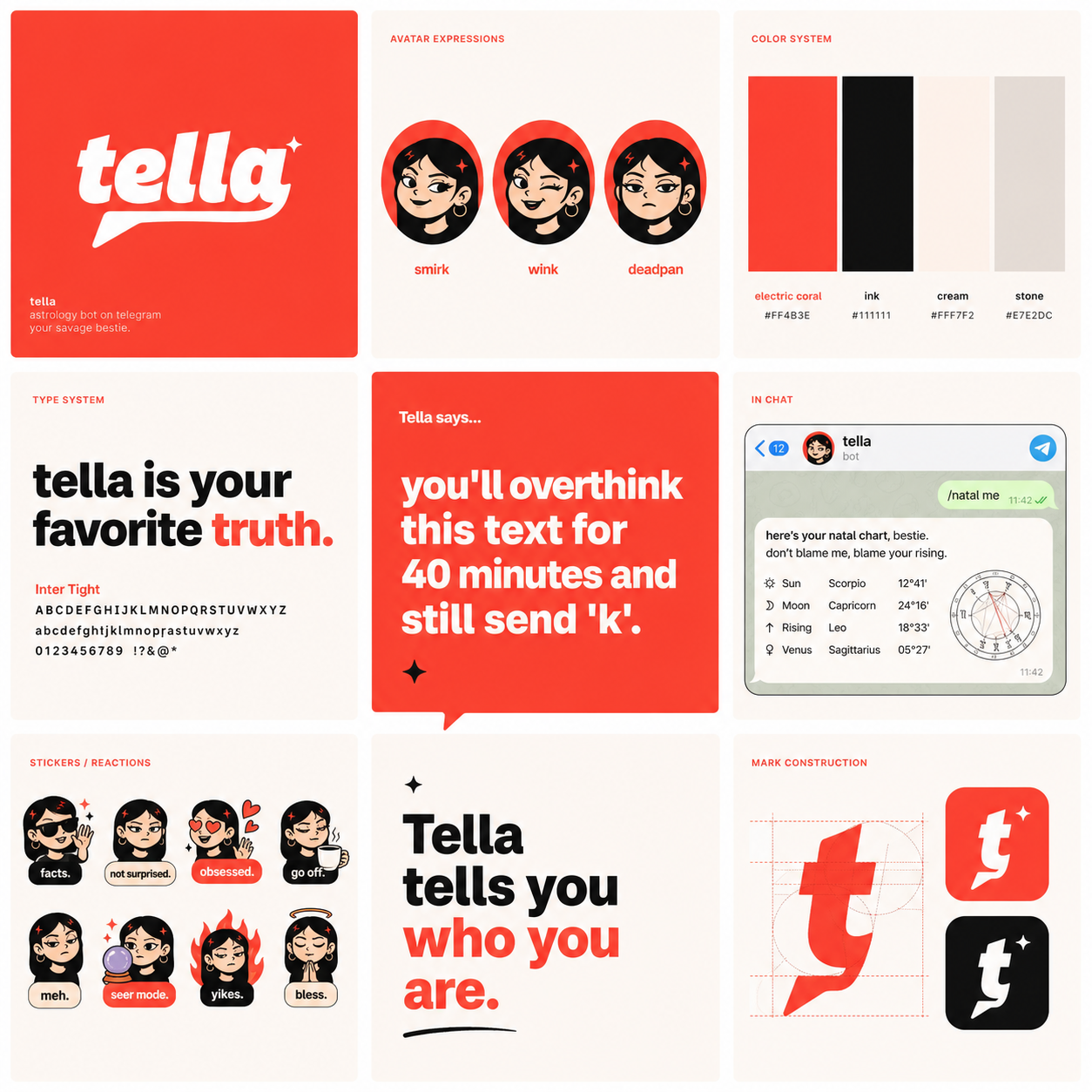
Tella · brand board
One astrology engine — two voices: Tella (bold, electric coral) and Dengo. The board gathers the mark, the type system and the avatar’s expressions on a single page.
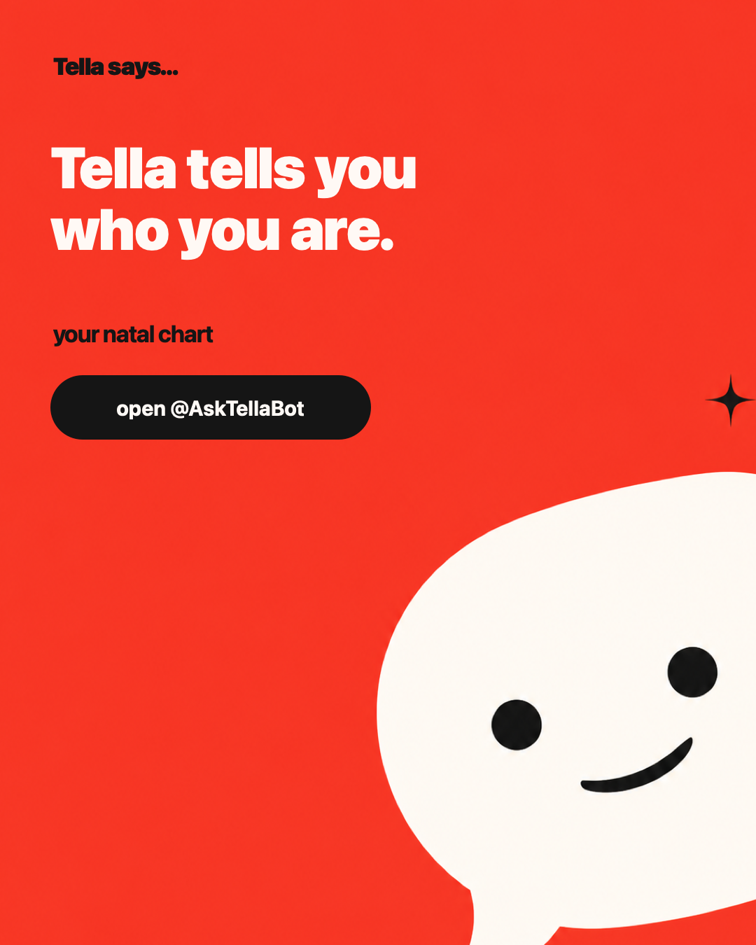
Tella · pinned post
The channel storefront: one slogan, one CTA, maximum coral. Pinned in @AskTellaBot since launch.
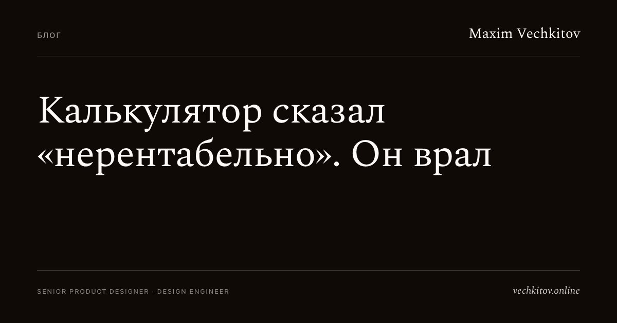
Blog covers · typography
Instead of stock illustrations — a one-template system: kicker, serif headline, byline. Stamped out by a script for every new post in a minute.